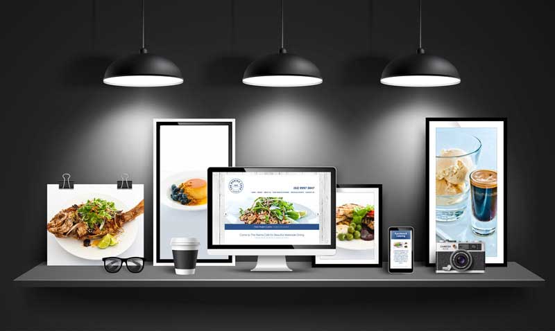
As the old saying goes, “a picture tells a thousand words”. With web design, quality imagery plays a huge role in the impression people get when they visit your website. Let’s explore 10 Website Imagery Tips for Improving Your Business Website.
Here are our 10 Top Tips for Maximising Your Website Through Striking Imagery.
10 Website Imagery Tips for Improving Your Website
- Keep It Relevant
- Make It Striking
- Use Contrast
- Use Warm colours
- Make It the Right Size
- Frame It Well
- Make It Unique
- Use Images of People
- Make It Casual
- Anticipate Your Audience
When people talk about content, they’re generally thinking about the writing on your website. Certain types of writing can indeed improve your SEO or search engine optimisation.
However, the images on your website also make up its content. You can’t search for a picture the way you can for a keyword.
However, when people see a striking image next to the title that shows up in a search, they’re much more likely to click on that web page or article than they are on one that doesn’t have a striking image next to it.
Plus, good imagery can help to keep your viewer interested in what you’re saying on your web page. So imagery can help to get more traffic as well as keep the viewers that are already there.
10 Website Imagery Tips for Improving Your Website
1. Keep It Relevant
The most important thing to ensure is that the images you’re using on your website are relevant to your product, service or brand. This doesn’t mean that you can’t experiment with images at all but there should at least be a loose connection between what you’re showing in your image and what you’re selling. There’s no point in using photos of beautiful landscapes if you’re selling kitchen utensils. But you can use photos of a beautiful kitchen, a chef, an outdoor kitchen or a beautiful meal since these are all relevant.
2. Make It Striking
There’s a difference between a beautiful image and a striking one. Some images can be both but this is rare. What you’re looking for is an image that will stay with the consumer for a while, whether or not it’s aesthetically pleasing.
3. Use Contrast
One way in which an image can be made striking is by using contrast. So if an image contains a lot of pastel colours, it may be quite beautiful but not necessarily striking. On the other hand, if an image uses contrasting colours like black and yellow, dark blue and yellow, black and white or even a melange of colours like you would see in a rainbow, it becomes more striking.
4. Use Warm colours
Another great way in which you can make your website imagery memorable is by using warmer colours like red, orange, yellow etc. You may not want to overload your website with these colours but a little bit of warmth can make a person more likely to take action and buy what you’re selling.
5. Make It the Right Size
Sometimes, people will take landscapes and reduce them to two inch squares in size. You can’t appreciate the beauty of a landscape in such a small space. It needs to be made a lot bigger. On the other hand, if you’re just using the image of a flower, a two inch square might be just right.
6. Frame It Well
It’s not just the image on a website that makes up the entire web experience. It’s also the colours around it, the font you use and the layout of the web page altogether. Your whole web page is one package. So make sure that the images, content, layout etc. go well together.
7. Make It Unique
An image might look great but if it’s the kind of stock image that everyone else is using too, then you’re not going to get much traction out of it. Go for something that expresses the uniqueness of your brand and what you’re trying to say.
8. Use Images of People
It may not always be possible to do this. But if it is possible, then you should make every effort to use images of people as well as things. For example, if you’re selling kitchen appliances, take a photo of someone using that appliance and having a good time. You’re trying to tell your viewers that they could also be doing what the people in the images are doing. This is far more effective than just using images of kitchen appliances.
9. Make It Casual
Sometimes, a photo might look a bit posed. It might seem obvious that the person in the photo is a model, not a real person. For example, if you have someone wearing a short cocktail dress, high heels and a face full of make up using a blender, it’s not going to be believable to your audience. So try to use images that seem more casual in nature.
10. Anticipate Your Audience
Try to think about your ideal audience’s point of view. To do this, you have first to know who they are. Are you trying to appeal to teenagers, professionals, middle-aged people, women, men, hipsters or artists? Try to develop a profile of the people who make up your audience, and you’ll soon find yourself coming up with images that will appeal to them.
Speak to the WordPress experts and take your business to the next level with a Pixel Fish Website.
Check out some of our latest Website Design projects.
Further Reading
More bang for your buck: How to maximise profit from your online store
Social Media Monitoring: 10 reasons your business can benefit from it
Customer Acquisition: How much does it cost to acquire a new customer?
8 Plugins That Can Boost Your WooCommerce Website
17 awesome WooCommerce website extensions


