Today in 2020 at the dawn of Google’s Mobile-First policy, 51.5% of all website visits come through mobile devices. This percentage rose steadily from 2015 (31% mobile web users) to 2017, when the 51% average mobile browsing trend was established.
Since then, a little over half of all website visits come from phones and tablets.. Some business owners are nodding their heads, unsurprised, but many are astounded that mobile browsing has taken such a dominant position.
A mobile-responsive website is no longer just a perk; it’s necessary. A website configured only for computer and laptop screens will miss out (or discourage) 50% of the potential online audience. This is why mobile responsive web design was introduced – to make websites that are accessible and interactive no matter what size of the screen the browser may be running on.
However, the strategic benefits of a responsive website design go beyond mobile browser accessibility. When planning your business strategy, every business owner knows to look for plans that offer stacked beneficial value. Mobile responsiveness provides a myriad of other advantages both on the market and behind the scenes.
Let’s dive into the top seven ways that mobile responsive web design can serve as a strategic benefit to your business.
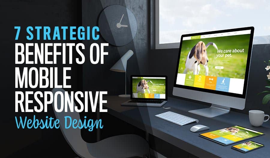
7 Strategic Benefits of Mobile Responsive Website Design
- Access the Quick-Browsing Mobile Audience
- Search Engine Page Ranking (SERP) and Mobile First
- Avoid a Mobile App
- Web and Mobile are Feature-Identical
- Adaptive Touch-Ready Design
- Specialise Your Mobile App Design
- Prepared for Mobile Security
1. Access the Quick-Browsing Mobile Audience
First and foremost, there’s 51%. There is no longer such a thing as a computer-only website or audience. Nearly every demographic in your audience can be expected to have a phone and possibly a tablet. People are also being equipped with tablets to do their work, ranging from mobile professionals to children in school. 51% of the total online traffic is conducted through mobile devices and that is 50% of your potential customers who might otherwise struggle to find your presence online.
Most websites appear when searched for on a mobile device browser. However, there is a big difference in accessibility between a responsive website and an unresponsive one. A responsive website intuitively changes the elements and also enlarges the buttons for easy tapping and touch controls so that your mobile users feel just as catered to as desktop browser visitors.
2. Search Engine Page Ranking (SERP) and Mobile First
Search Engine Page Ranking, aka SERP, is how high your website appears when users search for something related. Every business strives for top page ranking, appearing as the first recommended site for all your most relevant keywords and questions. This year, Google implemented the Mobile-First policy. In fact, the date has just passed at the beginning of September 2020.
From here on out, websites that perform well on mobile devices will be prioritised in Google SERPS, regardless of other shining achievements in SEO, page loading speed, metadata, and other SERP influences.
The important thing to understand about Mobile First is that it’s not just for mobile searches. Google is hoping to promote websites that offer an across-the-board experience and can be relied on no matter the search conditions.
By building a website with responsive design, you ensure that your site is ready for the Mobile-First SERP advantage.
3. Avoid a Mobile App
There has often been some confusion between a mobile-responsive website and a company’s mobile app. It’s true that many brands with an app have essentially rebuilt their website in the app programming structure. But why do that when you don’t have to?
Building a mobile app requires unique development, interface, APIs, and features. Not to mention the hoops jumped through to enter each app marketplace. A mobile responsive website is a far better investment if your goal is simply to mirror website features in a mobile setting.
If you don’t have a specific plan to design a mobile app, set that need aside. There’s no rush to develop an app, get on the app store, and introduce that whole new channel of sink-or-swim marketing. Instead, stick to your core services and invite your customers to find you through their mobile browsers.
A well-designed mobile responsive site will look and feel like a mobile app without the extra hassle, and without using up extra resources on user phones. A win-win situation for everyone.
4. Web and Mobile are Feature-Identical
Speaking of mirroring your website in a mobile setting, this common style of business app has one fatal flaw that you can easily avoid: Non-identical features between the website and mirror app. Some menu options may be missing, or the pictures might not load right, or worst of all – an API that works on the website does not work in the app. This is because businesses are trying to copy the same features over two completely different platforms – website vs mobile app. This is a strategic mistake when you can simply make a responsive website design that does both jobs.
Responsive webs design takes your existing website and uses mobile design best practices to re-size for mobile screens. Modular elements rearrange so that menu bars become hamburger expansion menus, buttons become larger, and content is attractive in these smaller scales. A mobile-responsive WordPress theme, for example, provides base elements designed to transition smoothly from one screen resolution to the next.
When you do this, mobile users have the exact same experience on the website and phone, with the clever trick being that the arrangements are really very different. Instead of designing a mostly-similar app from scratch, use responsive design to create an app-like feature that truly is identical in function and form to your browser website design. This way, customers know exactly what to expect (and what they can rely on) no matter how they choose to connect.
5. Adaptive Touch-Ready Design
Touch-readiness is a bid deal when it comes to mobile websites. In the early days of mobile browsers, we discovered that the sharp-cornered boxy buttons preferred by Windows alums were just too tight for mobile use. Not because the screens couldn’t render (though small text was an issue) but because the buttons were too small for fingertips to tap. Small buttons next to each other was another recipe for disaster and even links embedded in text can be tricky.
Not all websites are touch-ready, even if they appear nicely on a small screen. if your website isn’t designed to have large, well-spaced buttons and links, then the touch style of control won’t work well for your users.
Responsive web design deals with this situation twofold. First, the design includes rounded and spacious formats that look nice in both desktop and mobile browsers. Second, mobile resolution rearrangements prioritise touch-readiness and readability. Fonts will be larger and buttons more isolated than a simple mobile translation of the desktop browser version.
By using responsive web design, you can ensure that your website is not just beautiful but also useful in every screen resolution – no matter how small.
6. Specialise Your Mobile App Design
We mentioned earlier that mobile-responsive web designs allow you to put off the development of a mobile app. This is true and important for an even better reason than the economy: Your mobile app should be something special.
For example, a sporting goods brand might build their app into a workout activity tracker. A camping goods brand might build a trip-planning app. An interior decorator might build an AR app that envisions new colours in a photographed room. Many mobile apps are built to be live control panels unique to each user. Instead of using your mobile app and your place in the app stores to mirror your website features, offer your audience something uniquely valuable.
When your website is already fully mobile-responsive, your mobile app can be dedicated to even more specialised features. A mobile app is a fantastic way to deepen engagement with your audience by giving them something more than website features. Integrate with their lives and provide value beyond simple account management and order tracking.
7. Prepared for Mobile Security
Finally, don’t forget about cybersecurity. Mobile devices are notoriously less secure than most desktops by the simple nature of being accessible and mobile. A phone’s open wireless receiver may pass through a dozen or more unsecured wireless networks in the course of a busy day. A phone can also fall into the wrong hands, or just accidental hands, at any time. Borrowed by family and picked up by a friend, mobile devices are rarely secure.
In addition, mobile hackers are a new circle, with a whole new set of hardware and software considerations beyond your site to contend with. Encryption – including wireless transmission encryption – are a must. While you are likely not already a mobile security expert, responsive website developers are.
Pre-built responsive themes for platforms like WordPress often include security steps that might not be a part of a desktop-only website design.
Why Build Your Website with Mobile-Responsive Design?
Responsive web design is the wave of the future. It is the best of both the website and the mobile app, ensuring that customers get the same satisfying online experience whether they are connecting from their home, office, or browsing on the go. Responsive web design ensures your website is beautiful, accessible, and ready to beat the SEO competition without constantly rebuilding your mobile app or the mobile half of your design. At the same time, website responsiveness frees up your developers to make a unique mobile app separate from your website design.
To design or redesign your company website, you need to consider the Responsive Website Design Benefits. Contact us today to consult on your responsive web design plans.
Take your business to the next level with a Pixel Fish Website.
Check out some of our latest Website Design projects.
Further reading on Mobile Responsive Website Design:
Why your business needs to embrace Mobile Responsive Website Design
Amazing Mobile Website Design Benefits for Your Business
Understanding the Importance of Mobile Responsive Ecommerce Web Design
10 Tips for Effective Mobile Website Design
The Impact of Smartphones on Mobile Responsive Design
Mobile Responsive Website Vs Mobile App: Which is better for business?
Do you have a Mobile Friendly Website Design?
Get Mobile or Get Lost. The impact of Mobile Responsive Web Design
Top 8 Advanced WordPress Features and Plugins to Beat Your Competition
9 Business Web Design Package Features Your New Website Must Have
Why a Single Page Website Could Be the Perfect Launch Pad for Your Small Startup Business
Responsive Web Design: Why It Matters and How to Implement It
Top 10 Benefits of Mobile Friendly Web Design
How to Create a Landing Page for Your Small Business: A Comprehensive Guide