7 Top Responsive Design Benefits for Websites

Oct 28, 2025 | Mobile Responsive Design, Website Design

Reading Time: 8 minutes
Kevin Fouche

7 Top Responsive Design Benefits for Websites

Posted by Kevin Fouche, Pixel Fish Director

Kevin handles the planning, design, launch and training of every website that Pixel Fish creates. He ensures that every website is highly engaging and aligned with our client’s goals. With over 20 years of design and web industry experience to draw upon, Kevin aims to pass on his knowledge to our clients and like-minded businesses wanting to grow their online presence.

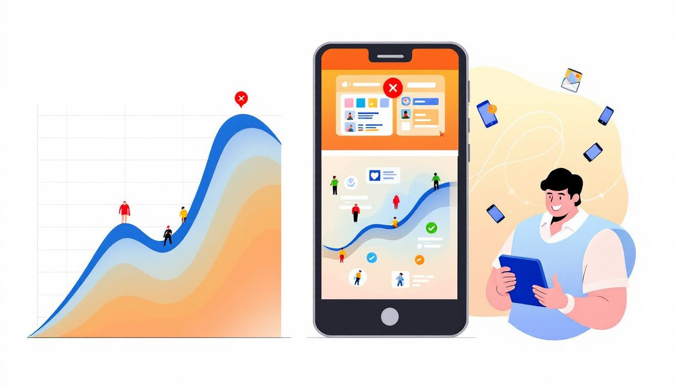
Looking to improve your website’s performance and user satisfaction? Responsive design benefits include better user experience, increased mobile traffic, improved SEO, and cost savings. Read on to discover why responsive design is essential for today’s websites. Let’s explore Responsive Design Benefits for Websites.

Responsive Design Benefits for Websites: Key Takeaways

  • Responsive web design enhances user experience across devices, fostering engagement and reducing bounce rates.
  • Implementing responsive design is cost-effective, as it simplifies maintenance and minimizes the need for multiple site versions.
  • A responsive website improves SEO performance, leading to higher search rankings and increased mobile traffic.

7 Top Responsive Design Benefits for Modern Websites

Responsive web design brings a plethora of benefits that cater to both businesses and users. Here are the top seven advantages: enhanced user experience, improved SEO performance, increased mobile traffic, cost-effective solutions, faster loading speeds, simplified maintenance, and gaining a competitive edge.

Each of these benefits plays a vital role in ensuring that a website meets the demands of today’s diverse internet users.

Introduction

The concept of responsive web design emerged as a solution to the challenges posed by the increasing diversity of internet access devices. In the early days of the internet, websites were designed with fixed screen sizes, which made them difficult to view on devices other than desktop computers. This approach was not only limiting but also frustrating for users who accessed the web on different devices.

With the advent of smartphones and tablets, the need for a more flexible approach to web design became apparent. Developers began to explore new ways to create web pages that could adapt to various screen sizes and resolutions. This led to the development of responsive web design, which uses fluid grids, flexible images, and media queries to ensure that web pages are displayed correctly on any device.

The evolution of responsive web design was significantly influenced by technological advancements. The introduction of fluid grid concepts and the increasing popularity of mobile devices played a crucial role in shaping the development of responsive design. Today, responsive web design is a standard practice, ensuring that websites are accessible and user-friendly across a wide range of devices.

What is Responsive Web Design?

Responsive web design is a web development strategy that dynamically alters the appearance of a website based on the screen size and orientation of the device being used. The fundamental concept of responsive design is to create web pages that can automatically detect the visitor’s screen dimensions and adjust the layout accordingly. This approach ensures a seamless user experience, whether accessed on a desktop computer, tablet, or smartphone.

One of the primary benefits of responsive web design is its ability to adapt to various screen sizes. This adaptability enhances user experience by providing a consistent and visually appealing interface across different devices. By using flexible images and fluid grids, responsive web designs ensure that content is displayed optimally, regardless of the device being used.

Another significant advantage of responsive web design is cost-effectiveness. Maintaining a single responsive site is far more economical than managing separate versions for mobile and desktop. This not only reduces development and maintenance costs but also simplifies content management and updates, as changes need to be made only once.

Moreover, responsive design offers several SEO advantages. Google favors responsive websites, which can improve a site’s ranking in search results. By using a single URL structure, businesses can avoid issues related to duplicate content and ensure that their SEO efforts are more efficient and effective.

In essence, responsive web design is not just about aesthetics; it’s about creating a functional, user-friendly, and search engine-optimized website.

Enhanced User Experience

User experience is paramount in web design. Responsive web design delivers optimal user experiences on both mobile and desktop devices. It creates a seamless experience across different devices, ensuring that users can navigate and interact with the website effortlessly, regardless of the screen size or orientation.

A responsive website fosters user trust through a consistent and engaging experience across devices. When users encounter a website that is easy to navigate and visually appealing on any device, they are more likely to stay longer and engage with the content. This not only enhances user engagement but also reduces bounce rates, as users are less likely to leave a website that provides a positive experience.

Furthermore, responsive design can enhance brand reputation, attracting more customers and boosting sales. By offering a consistent user experience, businesses can build trust and credibility with their audience, ultimately leading to higher conversion rates and customer loyalty. In today’s competitive digital landscape, providing a user-friendly and consistent experience is crucial for retaining and attracting visitors.

Improved SEO Performance

Responsive web design significantly impacts search engine optimization (SEO) performance. Google’s mobile-first indexing policy means that the mobile version of your site is primarily used for ranking and indexing. This emphasizes the need for responsiveness, as mobile-friendly websites are more likely to rank higher in search results.

One of the key benefits of responsive web design for SEO is the avoidance of duplicate content issues. By maintaining a single URL structure, businesses can ensure that their content is consistent across all devices, which simplifies indexing and crawling for search engines. This leads to improved SEO efficiency and a higher ranking in search results.

Additionally, responsive web designs ensure faster loading speeds, which is a critical factor for SEO. Fast-loading sites contribute to better user satisfaction, lower bounce rates, and higher engagement, all of which are favorable for search engine rankings. By implementing responsive design, businesses can enhance their SEO efforts and attract more traffic to their sites.

Increased Mobile Traffic

A graphic showing increased mobile traffic due to responsive design. 7 Top Responsive Design Benefits for Websites

The rise in mobile internet usage has been astronomical. Mobile internet traffic has grown by 163% since 2010, indicating a crucial shift in user behavior. More people now access the internet via mobile devices than ever before, making it essential for websites to cater to this growing audience.

Responsive web design significantly increases mobile traffic by optimizing websites for mobile devices. By ensuring that websites render properly on smaller screens, responsive design enhances user experience and accessibility, leading to higher return rates from mobile users. This is particularly important as today’s consumers increasingly prefer shopping and browsing on their mobile devices.

Furthermore, responsive websites adjust elements like buttons and images for better accessibility on mobile devices, avoiding issues like distorted images. This not only improves user experience but also increases the likelihood of mobile visitors staying longer and engaging more with the content. In a world where mobile browsing is becoming the norm, optimizing for mobile traffic is no longer optional; it’s a necessity.

Cost-Effective Solution

Maintaining a single responsive site is a cost-effective solution for businesses. By opting for one responsive website rather than multiple site versions, companies can save on development and maintenance costs. This approach simplifies the management process, allowing businesses to focus their resources on improving a single site instead of managing several.

Responsive sites typically lead to lower overall development and maintenance costs compared to a separate mobile site and desktop versions. This is because updates and changes need to be made only once, reducing the time and effort required for site management. Additionally, a unified site structure simplifies analytics tracking, making it easier to monitor user engagement and make informed decisions.

Implementing responsive design also helps reduce the costs associated with marketing campaigns, as there’s only one URL to promote. This not only saves money but also ensures a consistent user experience across all devices, which is crucial for building trust and credibility with the audience. By adopting responsive design, businesses can save time, reduce costs, and improve their overall digital marketing efforts.

Faster Loading Speed

Responsive design techniques lead to optimized loading speeds, which is crucial for retaining users. Fluid grids adjust the layout based on screen size, allowing quicker content rendering as elements fit appropriately. This ensures that users do not experience delays when accessing the website, which can significantly reduce user abandonment rates.

Implementing responsive images is another technique that enhances loading efficiency. By ensuring that only the necessary size of an image is loaded for the device, responsive web designs ensure faster loading times. This not only improves user satisfaction but also contributes positively to SEO, as search engines favor fast-loading sites. Additionally, responsive image display plays a crucial role in this process.

In a digital world where users expect instant access to content, optimizing loading speed is crucial for maintaining user engagement and satisfaction.

Simplified Maintenance

One of the significant advantages of responsive design is the simplification of website maintenance. With a unified responsive site, updates can be made across all devices without duplicating efforts. This streamlines the management process by consolidating content strategies and administrative interfaces.

Using a single responsive website reduces the need for extensive testing and support associated with separate mobile and desktop sites. This not only saves time but also frees up resources, allowing teams to concentrate on more critical tasks like marketing and content creation. By minimizing the complexity of tracking user interactions across different site versions, responsive design makes analytics more straightforward and actionable.

Responsive design also enhances mobile friendliness, ensuring that websites remain user-friendly across all devices. This consistency in user experience is crucial for retaining visitors and building long-term relationships with the audience. In essence, responsive design not only simplifies maintenance but also improves the overall efficiency of website management.

Competitive Edge

In today’s digital landscape, having a responsive website provides a competitive advantage. Improved SEO rankings attract more traffic and increase online visibility, which is essential for staying ahead of competitors. Businesses that have switched to responsive design have reported significant increases in sales, highlighting the benefits of this approach.

For instance, WebUndies experienced a 188% increase in revenue after switching to responsive design. O’Neill Clothing saw mobile transactions increase by 112.50% on iPhones and 333.33% on Android after adopting responsive design. These case studies demonstrate the tangible benefits of responsive design in terms of increased sales and customer engagement.

Responsive design also allows businesses to maintain all backlinks from the original site, which is crucial for SEO. By ensuring a seamless and consistent user experience, businesses can build trust and credibility with their audience, ultimately leading to higher conversion rates and customer loyalty.

In a competitive digital environment, having a mobile-friendly and user-friendly website is crucial for attracting and retaining potential customers. To stay ahead, businesses must embrace responsive design and continuously optimize their websites to meet the evolving needs of their audience. By doing so, they can enhance their SEO efforts, improve user engagement, and achieve a higher ranking in search results, ultimately driving more traffic and increasing sales.

Responsive Design Benefits for Websites: Summary

In conclusion, responsive web design offers numerous benefits essential for modern websites’ success. From enhanced user experience and improved SEO performance to increased mobile traffic and cost-effective solutions, the responsive design addresses the diverse needs of today’s internet users. By implementing responsive design, businesses can ensure faster loading speeds, simplified maintenance, and a competitive edge in the digital landscape.

Adopting responsive web design is not just about keeping up with trends; it’s about staying ahead and meeting the expectations of your audience. As technology evolves, businesses must prioritize responsive design to remain relevant and competitive. By doing so, they can build trust, improve user engagement, and ultimately achieve their business goals.

Responsive Design Benefits for Websites: Frequently Asked Questions

What is responsive web design?

Responsive web design is an essential strategy that ensures websites adapt dynamically to various screen sizes and orientations, utilizing fluid grids, flexible images, and media queries. This approach guarantees optimal user experience across all devices.

How does responsive design improve SEO performance?

Responsive design enhances SEO performance by utilizing a single URL for mobile and desktop versions, streamlining indexing and preventing duplicate content issues. This approach ultimately supports better visibility and rankings in search engines.

Why is responsive design important for mobile traffic?

Responsive design is crucial for mobile traffic as it ensures websites are optimized for smaller screens, enhancing user experience and encouraging higher return rates from mobile users. Prioritizing responsive design leads to better engagement and accessibility for your audience.

How does responsive design reduce maintenance costs?

Responsive design effectively reduces maintenance costs by enabling the management of a single website that adapts to various devices, thus simplifying updates and minimizing the need for multiple site versions.

What competitive advantages does responsive design offer?

Responsive design significantly enhances SEO rankings and online visibility, improving user engagement and increasing sales. This positions businesses favourably in the competitive digital environment.

Take your business to the next level with a Pixel Fish Website.

Check out some of our latest Website Design projects.

Further Information
Why your business needs to embrace Mobile Responsive Website Design
3 Reasons Mobile Responsive Design is Crucial for Your Online Success
Understanding Mobile Responsive Ecommerce Web Design
The Impact of Smartphones on Mobile Responsive Design

Stand out from your competition with a Pixel Fish website!

Contact us today on 02 9114 9813 or email info@pixelfish.com.au

Small Business Website Packages   | Custom Website Design   |   Ecommerce Websites

Related Blogs

Mastering Website Design: A Comprehensive Guide

Mastering Website Design: A Comprehensive Guide

Designing a website, specifically the design of a website that stands out and achieves your business goals, can be challenging. This guide will help you understand each step, from defining your site’s purpose and planning content to optimising user experience.

Contact Pixel Fish - Website Design Agency

Get Started with a new Pixel Fish Website

We would love to hear about your upcoming website project

Kevin Fouché, Pixel Fish Director