Just as being responsive is important in any customer service-related endeavour, mobile responsive design is crucial for your online success.
A digital environment in which most of your potential customers now use smartphones or tablets to access information about your company necessitates a web experience that leaves them satisfied, regardless of device.
What is Responsive Design?
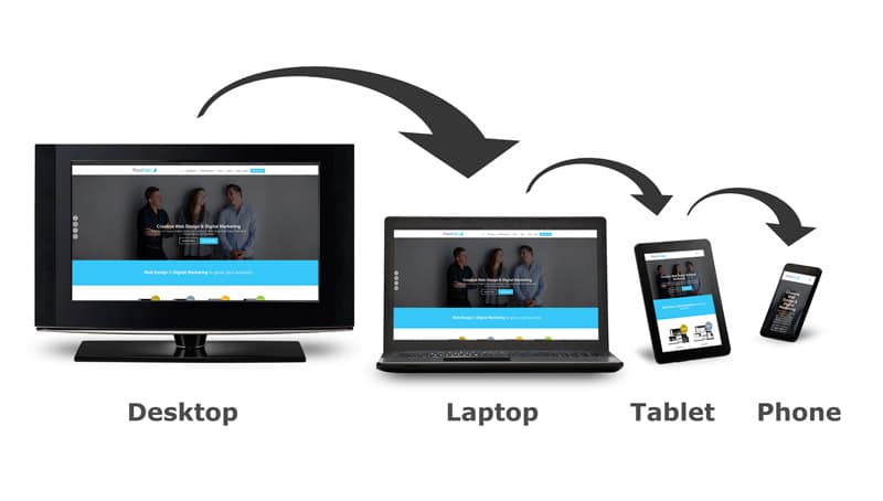
First, let’s start with a definition. Before reading this blog, you should know exactly what we mean when we talk about “mobile responsive design.” We could get into technicalities, but the result remains the same: responsive design means designing a website in a way that adjusts its size, text and graphics automatically to a user’s screen size.
Done right, these dynamic adjustments mean a more flawless experience regardless of the size of your device’s screen. In today’s digital age, mobile responsive design is more than just a nice option to have. It’s necessary for business growth and customer satisfaction, and here are three reasons why.
1. Google’s “Mobilegeddon”
We may as well start with the big one. As we’ve detailed on our blog, Google introduced an update to its search algorithm this past April that turned responsive design from a nice option into a necessity.
The reasoning behind this update was simple: the search engine giant noticed that an increasing number of its users access the site from a mobile device. In fact, mobile searches are on the verge of surpassing their desktop counterparts, with 48% of searches in 2014 coming from a smartphone or tablet.
Mobile users will gain little from finding a website that doesn’t adjust to their small screen over one that does. That’s why Google began to prioritise mobile-friendly sites in its results on April 21. And for the search engine, mobile-friendliness may as well be a synonym of responsiveness, as the search engine has made clear in its Web Fundamentals knowledge base. The company even offers a test for web developers to check the mobile-friendliness of their site.
2. User Experience
Even taking aside Google’s new standards, mobile responsive design is crucial because of your audience. After all, mobile internet usage surpassed its desktop counterpart for the first time this year, and that gap is only expected to widen in the future. In other words, your target audience is more likely to find and experience your website from a mobile device than they would be from a laptop or desktop computer.
Why should that matter? Because offering a flawless user experience can make the difference between a one-time visitor bouncing off your page or becoming a customer. In an article on the importance of responsive design, the Huffington Post quotes a Google study that found your visitors to be impatient: if they don’t find what they’re looking for immediately, there is a 61% chance they’ll jump off to visit a competitor’s website. which has a very tangible effect:
3. Increased Conversions
Closely connected to the point on user experience, happy visitors will likely mean higher conversions to leads and, ultimately, customers. If you engage in e-commerce, this may be obvious. Almost 70% of tablet owners use their device to shop online, and they will jump off quickly to a competitor if shopping on your website does not meet their needs or expectations. Though to a lesser degree, the same is true for smartphone owners.
But even if you don’t engage in e-commerce, a responsive website can make a major impact on your conversion rates. The Aberdeen Group conducted a study that found visitor-to-customer conversion to be 11% higher on responsively designed websites compared to static sites. In reality, that’s probably at the low end of improvement, as other companies reported conversion rate increases of up to 400% as a result of their switch to a mobile responsive website.
In short, as we’re moving deeper into the digital age, mobile responsive design is increasingly crucial to your business success. Its improved user experience and increased conversion, not to mention the impact it can make on your search engine optimisation, all make for compelling reasons to make the switch to responsive. But take them together, and it’s easy to see that in 2015, responsive design is no longer just an option – it’s a necessity. And if you’re ready to make that switch, contact us!
Watch our video on Mobile Responsive Website Design: ‘Get Mobile or Get Lost’
More bang for your buck: How to maximise profit from your online store
Social Media Monitoring: 10 reasons your business can benefit from it
Customer Acquisition: How much does it cost to acquire a new customer?
8 Plugins That Can Boost Your WooCommerce Website
17 awesome WooCommerce website extensions