How to Design a WordPress Homepage That Actually Converts
Your WordPress website might look good, but is it actually working? For most Australian small businesses, the homepage is where potential customers land first—and where they often leave without taking action. The difference between a visually appealing homepage and a high converting homepage isn’t just aesthetics. It’s strategy.
A website’s design is essential for digital marketing success, as it plays a key role in generating leads, increasing sales, and building brand credibility.
In this guide, we’ll walk through exactly how to design a WordPress homepage that turns visitors into enquiries, bookings, and sales. These are the same principles we use at Pixel Fish for our Sydney client projects, where simple changes to layout, copy, and speed often lift enquiry rates by 20-40% within a few months. A conversion-focused homepage not only improves user engagement and reduces bounce rates, but also drives revenue growth by enhancing your marketing results.
Key Takeaways
- This article provides a practical, step-by-step framework for designing a high converting WordPress homepage that generates leads and sales—not just one that “looks nice” in your portfolio.
- Most Australian small businesses already attract traffic but lose conversions due to weak hero sections, unclear navigation, and slow loading times. This guide shows you how to fix each issue.
- WordPress is ideal for conversion-focused homepages because it combines flexible design options (themes and page builders) with powerful CRO tools including analytics, A/B testing, and form plugins. You can use Google Analytics or other tools to track and analyze your website’s performance.
- Pixel Fish uses these exact principles with our Sydney clients, where targeted improvements to layout, copy, and optimizing your website’s performance regularly deliver measurable conversion gains within 60-90 days.
- The guide finishes with FAQs answering common questions about costs, timelines, WordPress theme selection, and whether to DIY or hire an agency like ours.
Why Your WordPress Homepage Must Be Built to Convert
Your homepage is the front door of your business online. In 2024, visitors form their first impression of your brand in under five seconds. That’s not much time to communicate who you are, what you offer, and why someone should choose you over a competitor. A poorly designed website loses that opportunity before it even starts.
For most Pixel Fish clients, the home page is responsible for 50-70% of total site traffic. It’s simultaneously the top source of new leads and the biggest source of lost opportunities. Every confused visitor who bounces is a potential customer walking away.
What does “conversion” actually mean for typical Australian SMEs? It depends on your business model. For a service business, it might be contact form enquiries or discovery call bookings. For a tradesperson, it’s quote requests. For e-commerce stores, it’s online purchases. For professional services, it could be email sign-ups or resource downloads. The specific action varies, but the principle remains: your homepage should guide users toward one clear outcome.
The contrast between a “pretty but passive” homepage and a conversion-driven one is stark. A passive homepage features a generic hero image, vague copy like “Welcome to Our Business,” and weak calls to action buried at the bottom. A high-converting homepage deliberately guides visitors through a narrative that addresses their pain points and leads them to one main action. Using engaging visuals—such as images, videos, or illustrations—can reinforce your message and evoke emotions, which helps increase engagement and conversions.
Here’s a concrete example. A Northern Beaches tradie came to us with a homepage featuring a slideshow of job photos, six different service categories above the fold, and a “Contact Us” link tucked in the footer. After simplifying the hero section to focus on their core message—emergency plumbing services for local homeowners—and adding a prominent “Call Now” button, enquiries doubled within eight weeks. Same traffic, completely different results.
Understand Your Visitors and Define a Single Homepage Goal
Before you touch any design elements, you need a clear understanding of who you’re designing for and what you want them to do. Strategy comes before aesthetics.
For SMEs, conversion often means turning website visitors into leads, inquiries, or sales. A well-designed homepage plays a crucial role in attracting new customers by guiding them toward clear actions, such as contacting your business, signing up for a service, or making a purchase.
Creating Visitor Personas
Start by mapping out one or two clear visitor personas. Who actually lands on your homepage? For a Sydney web design agency, this might be “a time-poor business owner looking for a new website in under three months who wants fixed pricing and local support.” For a medical clinic, it could be “a parent searching for a bulk-billing GP near their suburb who can book online.”
Think about what your target audience wants to know in the first 30 seconds. They’re asking themselves: “Am I in the right place? Can this business solve my problem? What should I do next?” Your homepage needs to answer all three questions immediately.
Choosing Your Primary Goal
Every high converting homepage revolves around one primary goal. Not three. Not seven. One. This might be “book a free 30-minute strategy call,” “request a quote,” or “view our key services.” Secondary actions can exist, but they should support the primary goal rather than compete with it.
Different business types require different goals. A local health clinic’s primary goal should be appointment bookings. A B2B service provider might focus on consultation bookings or resource downloads. An eCommerce store typically drives visitors toward best-selling products or current promotions.
The critical point is that every design and copy decision you make from here should reinforce this single primary goal. You’ll measure success through Google Analytics—tracking form completions, click-through rates on your main CTA, and overall conversion rates.
Key Elements of a High‑Converting WordPress Homepage
Before diving into specifics, let’s outline the must-have building blocks of a page that converts. Think of these as your homepage’s core message components—each one plays a role in the conversion journey.
| Element | Purpose |
|---|---|
| Hero Section | Capture attention and communicate core value in under 5 seconds |
| Value Proposition | Explain what you do, who you help, and what makes you different |
| Primary CTA | Guide visitors to take your most important action |
| Services/Solutions | Show visitors how you can help them specifically |
| Trust Signals | Build credibility through social proof, testimonials, and credentials |
| Navigation | Help visitors find what they need without confusion |
| Footer | Provide secondary links, contact details, and reassurance |
| Mobile Experience | Ensure all the elements work seamlessly on phones and tablets |
These key elements work together. Stunning visuals mean nothing without clear copy. A compelling headline falls flat if your page speed is terrible. No single element can fix a fundamentally confusing homepage—you need all of them working in harmony.
The good news? All of these can be implemented using standard WordPress tools: the native block editor, a modern WordPress theme, and a handful of quality plugins.
Designing a Hero Section That Hooks Visitors in 5 Seconds
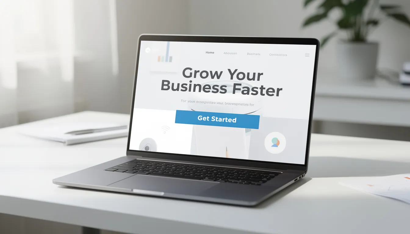
The hero section is prime real estate on your homepage. It’s the first thing visitors see before they scroll, and for mobile users, it often determines whether they stay or leave. Research shows that a mobile-optimised landing page can boost conversion rates by 27%—and the hero section is where that optimisation matters most.
Layout and Structure
Your hero section should include four key features:
- Bold H1 headline – Your compelling headline that immediately communicates your core value
- One to two line subheading – Expands on the headline with specific benefits
- One primary CTA button – The action you want visitors to take
- Relevant supporting visual – An image or short looping video that reinforces your message
Keep it clean. Avoid cluttering this section with multiple competing messages or navigation elements. The goal is to hook visitors and guide them toward your call to action CTA.
Crafting Your Headline
Your headline should speak directly to your target audience and promise a clear benefit. Avoid generic statements like “Welcome to Our Website” or “Your Trusted Partner.”
For a WordPress agency like Pixel Fish, an effective headline might be: “WordPress Websites That Turn Sydney Visitors into Customers.” This works because it’s specific (WordPress, Sydney), addresses an outcome (turning visitors into customers), and speaks to the visitor’s primary goal.
For different business types, consider:
- Tradesperson: “Same-Day Emergency Plumbing for Sydney Homes”
- Health clinic: “Bulk-Billing Family GP in Parramatta – Book Online Today”
- eCommerce: “Handcrafted Australian Skincare – Shop Our Bestsellers”
Writing Your Subheading
The subheading answers three questions in one sentence: who you help, what you do, and what result you create.
Example: “We design custom WordPress sites for Australian small businesses that want more enquiries—not just more traffic.”
This immediately tells visitors they’re in the right place and builds connection by addressing their actual goal.
Hero CTAs
Your hero needs one primary button with action words that create urgency or promise value. “Book a Free Website Strategy Call” is stronger than “Contact Us.” “Get Your Free Quote” beats “Learn More.”
You can include a softer secondary link (e.g., “View Recent Projects”) for visitors who aren’t ready to convert yet, but make sure it’s visually subordinate to your primary CTA. The primary button should use contrasting colours and be large enough for mobile taps—at least 44×44 pixels.
Hero Imagery
Avoid stock photos of generic handshakes or smiling business people. These signal “template website” and undermine trust. Instead, show your real team, actual client projects, or your work environment.
Keep file sizes optimised—compress images to WebP format and aim for under 200KB to protect page speed. A beautiful hero image that takes six seconds to load will tank your conversions.
Crafting a Clear Value Proposition and Benefit‑Led Copy
Directly beneath your hero section, you need copy that reinforces why visitors should choose you. This isn’t the place for corporate jargon or lengthy paragraphs. Think concise value proposition plus three to four benefit-focused bullet points.
Your Value Proposition Statement
In one to two sentences, explain what makes your business different and valuable. Be specific. “Pixel Fish designs custom WordPress sites for Australian small businesses that want more enquiries, not just more traffic” works because it’s clear about the audience (Australian small businesses), the offering (custom WordPress sites), and the outcome (more enquiries).
Compare this to vague alternatives like “We provide innovative digital solutions for your business needs.” The second statement says nothing meaningful.
Benefit-Focused Copy
List three to four concrete benefits that matter to your target audience. These should address specific pain points and promise tangible outcomes:
- Launch in as little as 6 weeks – Because your visitors are tired of drawn-out projects
- Fixed-price website packages, no hidden fees – Because surprise invoices destroy trust
- Hosting and support handled locally in Sydney – Because offshore support creates headaches
- Sites built for conversions, not just looks – Because traffic without leads is pointless
Write in plain English. Avoid agency jargon like “leverage synergies” or “cutting-edge paradigms.” Your visitors don’t speak that same language—they want to know you understand their problems.
Visual Layout
Consider presenting your benefits in a three-column layout with small icons above each point. This creates visual separation, improves scannability, and breaks up text for visitors who scroll quickly. Categories might include “Strategy,” “Design,” and “Ongoing Support” with a brief description under each.
Showcasing Services and Solutions Without Overwhelming Visitors
Your homepage should give visitors a clear understanding of what you offer—but not overwhelm them with every possible service variation. The goal is to generate leads by helping visitors identify the right solution for their needs, then routing them to deeper service pages.
Structuring Your Service Blocks
Present three to six core service categories in a simple grid layout. Each block should include:
- A clear service title (e.g., “Custom WordPress Design”)
- A one to two line description focused on outcomes
- A small icon or relevant image
- A “Learn more” or “View service” link
For a web design agency like Pixel Fish, this might look like:
| Service | Description |
|---|---|
| Custom WordPress Design | Bespoke WordPress website design that reflects your brand and converts visitors into enquiries |
| WooCommerce Stores | Fully-featured eCommerce sites that make selling online simple |
| Small Business Packages | Fixed-price website packages for businesses ready to launch fast |
| Hosting & Care Plans | Australian hosting, security updates, and ongoing support handled for you |
Linking to Deeper Pages
Each service block should link to a dedicated service page where visitors can learn more and convert. This internal linking strategy keeps users moving through your site rather than bouncing. Think of your homepage as a hub that routes different visitor types to the most relevant new page for their needs.
Group services logically so visitors can instantly see what’s on offer. Pixel Fish often uses categories like “Websites,” “eCommerce,” “Branding,” and “Support & SEO” to create clarity without clutter.
Building Trust: Social Proof, Case Studies and Credibility Signals
Trust is often the deciding factor when a Sydney business owner chooses a web design partner. They’re committing significant budget to someone they’ve never met—social proof helps bridge that gap.
Testimonials Section
Display three to five short testimonials with client names, business names, and locations. “Sarah T., Bondi, NSW” is more credible than an anonymous quote. Add headshots or company logos where possible.
The most effective testimonials mention specific outcomes: “Our enquiries increased by 35% within 90 days of the new WordPress site launching” beats “Great team, highly recommend” every time. Numbers build connection because they’re verifiable and tangible.
Mini Case Studies
Include at least one mini case-study callout on your homepage. Structure it simply:
- Headline: “30% More Quote Requests in 3 Months”
- Two to three sentence story: “A Sydney construction firm came to us with an outdated WordPress site that wasn’t generating leads. We redesigned their homepage with a clear value proposition, simplified navigation, and prominent CTAs.”
- Result: “Quote requests increased by 30% within 90 days of launch.”
This format is easy to scan and immediately demonstrates your capability to convert visitors.
Additional Trust Signals
Beyond testimonials, consider including:
- Industry association badges or certifications
- “Featured in” mentions from media or publications
- Security badges (SSL, privacy compliance)
- Clear contact details in header and footer
- Years in business (“Sydney WordPress experts since 2011”)
These credibility signals help potential customers feel confident in their decision.

Designing Navigation and Page Structure That Guides Action
Confusing menus are one of the biggest reasons visitors scroll aimlessly and eventually leave. Your navigation should guide users toward conversion, not create decision paralysis.
Top Navigation Best Practices
Keep your main menu to five to seven core items maximum. A typical structure might be:
- Home
- About
- Services (with dropdown if needed)
- Portfolio/Work
- Blog
- Contact
Add a standout button for your primary CTA—“Get a Quote” or “Book a Call”—in a contrasting colour. This should be visible on every page.
Interestingly, research from Unbounce found that removing the navigation bar entirely on focused landing page designs increased conversions by 30%. While this may be too extreme for a homepage, it illustrates the principle: fewer distractions mean more conversions.
Homepage Layout as Narrative
Structure your homepage like a story that visitors scroll through:
- Hero – Hook them with your core message
- Value Proposition – Explain why you’re the right choice
- Services – Show what you offer
- Proof – Build trust with testimonials and case studies
- Process – Explain how working with you works
- Final CTA – Give them one more clear opportunity to convert
Separate each section with adequate white space. This prevents visual overwhelm and helps each element breathe.
Footer Design
Your footer should summarise key elements without being cluttered:
- Key navigation links
- Contact details (including Australian phone number)
- A brief reassurance line (“Sydney-based WordPress experts since 2011”)
- A final CTA button
- Social media links if relevant
Mobile Navigation
Mobile traffic accounts for over 50% of all web visits. Your mobile friendly navigation—typically a hamburger menu with a sticky header—must be tested on real devices. Ensure your main CTA remains easy to tap and that menu items are large enough for finger navigation across all screen sizes.
Optimising for Speed, Mobile and Technical Performance
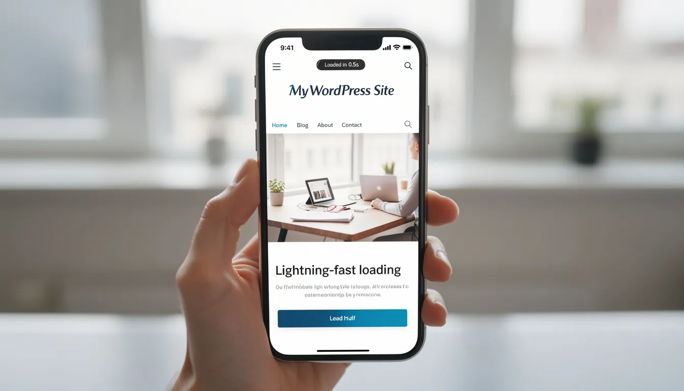
Even the most beautiful homepage fails if it takes forever to load or breaks on mobile. Statistics show that 53% of mobile users abandon sites that take longer than three seconds to load. Performance optimization isn’t optional—it’s essential.
Choosing the Right WordPress Theme
Start with a fast, lightweight WordPress theme suited to business sites. Options like GeneratePress or Astra offer excellent performance out of the box without bloat. Avoid multipurpose themes packed with features you’ll never use—they often come with code overhead that kills load speed.
For clients who need something truly tailored, a custom Pixel Fish build ensures both design flexibility and technical performance.
Speed Optimisation Tactics
Implement these concrete improvements:
| Tactic | Tool/Approach |
|---|---|
| Compress images | Convert to WebP format, aim for under 200KB per hero image |
| Enable caching | Use a caching plugin like WP Rocket or WP Super Cache |
| Minimise scripts | Remove unused CSS/JS, defer non-critical scripts |
| Use quality hosting | Choose Australian or regional hosting with good server response times |
| Implement CDN | Use Cloudflare or similar to distribute assets globally |
These tactics combined can reduce load times by 50-70%.
Testing Performance
Check your website’s performance regularly using Google PageSpeed Insights and GTmetrix. Aim for under two seconds load time for your homepage. Pay particular attention to Core Web Vitals metrics, which Google uses for ranking signals.
Responsive Design
Responsive design means your homepage adapts fluidly across devices. Test your hero section, menus, CTAs, and lead generation forms on actual phones and tablets—not just browser emulators. Adjust font sizes, spacing, and button dimensions for mobile. A CTA button should be at least 44×44 pixels for comfortable tapping.
Using WordPress Tools to Support Conversions
WordPress offers powerful tools for building conversion-focused homepages without requiring technical expertise. Here’s a practical overview of what supports your marketing efforts.
Page Builders and Editors
The native WordPress block editor (Gutenberg) handles basic homepage layouts well. For more flexibility, reputable page builder plugins like Elementor or Beaver Builder allow you to create custom hero sections, service grids, and CTA blocks using drag-and-drop interfaces.
When working with a page editor, focus on creating sections that serve your conversion goals. Every block should either communicate value, build trust, or guide users toward action.
Essential Plugin Categories
Keep your plugin stack lean but functional:
| Category | Examples | Purpose |
|---|---|---|
| Forms | Gravity Forms, WPForms | Lead generation forms, contact forms, quote requests |
| SEO | Rank Math, Yoast | Meta titles, descriptions, keyword optimisation |
| Analytics | MonsterInsights | Track conversions, user behavior, bounce rate |
| Speed | WP Rocket, Autoptimize | Caching, minification, performance optimization |
| Security | Wordfence, Sucuri | Protect forms from spam, maintain security badges |
WooCommerce Integration
For businesses selling online, WooCommerce allows you to surface product highlights or featured collections directly on your homepage. This supports sales by putting best-sellers in front of visitors immediately rather than requiring extra clicks.
Less Is More
Only install plugins that directly support user experience, conversions, or security. Every additional plugin adds potential load speed impact and security vulnerabilities. Keep everything updated—ideally through a support plan or agency partner like Pixel Fish.
Step‑by‑Step Process to Redesign Your WordPress Homepage
Ready to implement? Here’s a practical checklist you can follow over two to four weeks to improve your homepage’s conversion performance.
The Seven-Step Process
- Review analytics and current performance – Check your bounce rate, time on page, and current conversion rates in Google Analytics. Establish your baseline key metrics.
- Clarify homepage goal and audience – Define your one primary goal and one to two visitor personas. Write these down.
- Sketch a new layout – Map your new homepage structure on paper or in a tool like Figma. Include hero, value proposition, services, trust signals, and final CTA.
- Update copy – Rewrite your headlines, value propositions, and CTAs using the principles in this guide. Focus on benefits, not features.
- Implement changes in WordPress – Use your theme or page builder to rebuild the homepage according to your sketch. Optimize images as you go.
- Test on devices and browsers – Check your homepage on phones, tablets, and different browsers. Test all forms and buttons.
- Measure results for 30-90 days – Compare your “before” baseline to new performance data. Track form submissions, CTA clicks, and overall conversion rates.
Taking a Benchmark
Before publishing your new homepage, screenshot your current Google Analytics data. Note your bounce rate, average session duration, and enquiry volume. Compare these numbers 60-90 days after launch to measure the impact of your changes.
When to Call in Help
If you’re short on time or not confident with design, brief an agency like Pixel Fish with this structure to accelerate the project. Many improvements—copy, CTAs, basic layout tweaks—can be made without a full rebuild, especially if your WordPress site already runs on a modern theme.

Measuring and Improving Conversions Over Time
A high converting homepage is never “finished.” It’s refined continuously using real visitor data.
Key Metrics to Track
Focus on these measurements:
- Conversion rate on primary CTA – What percentage of visitors complete your main action (form submission, booking, purchase)?
- Click-through rates – How many visitors click your main buttons and links?
- Bounce rate – What percentage leave without taking any action?
- Scroll depth – How far do visitors scroll before leaving?
- Form abandonment – Are visitors starting forms but not completing them?
Setting Up Tracking
In Google Analytics 4, set up events or conversions to track homepage actions. The simplest approach is tracking thank-you page views after form submissions. You can also track button clicks using event parameters.
If you’re using a form plugin like WPForms or Gravity Forms, many include built-in analytics showing submission rates and abandonment points.
A/B Testing Ideas
Test different versions of your homepage elements to find what converts best:
- Try different headlines in your hero section
- Test alternative hero images
- Compare CTA labels (“Get a Quote” vs “Request Pricing”)
- Experiment with layout variations (single-column vs multi-column)
Run each test for at least two to four weeks to gather statistically significant data. Change only one variable at a time so you can attribute results accurately.
Quarterly Reviews
Schedule a quarterly review of homepage performance. Update case studies with recent results, refresh imagery, and tweak messaging to match your current offers and target audience priorities. This keeps your homepage fresh and aligned with your business goals.
How Pixel Fish Designs Homepages That Actually Convert
At Pixel Fish, we’ve been designing WordPress websites for Australian businesses since 2011. Our approach combines strategic thinking with technical expertise to create homepages that actually generate leads—not just look impressive in a portfolio.
Our typical process starts with a discovery workshop where we understand your business, your target audience, and your conversion goals. We then conduct competitor and keyword research to inform messaging and positioning. From there, we wireframe the homepage structure, design custom visuals, build in WordPress, launch, and provide ongoing hosting and support.
Here’s a recent example: In 2023, we redesigned the homepage for a health clinic in Parramatta. Their previous site featured generic stock photos, buried CTAs, and slow loading times. We rebuilt with a clear value proposition, prominent online booking integration, and optimised page speed. Within 90 days, online appointment bookings increased by 42%.
We offer fixed-price small business website packages as well as fully custom designs. Every project includes mobile optimisation, basic on-page SEO, and a clear conversion strategy. Our Sydney-based team handles hosting and ongoing care, so you’re not left managing technical updates yourself.
Ready to redesign your WordPress homepage? Book a free strategy call with Pixel Fish to review your current site and map out improvements.
FAQ: WordPress Homepage Conversion Questions Answered
How long does it take to redesign a WordPress homepage that converts?
Timelines vary based on scope. Minor tweaks—updating headlines, improving CTAs, optimising images—can often be completed within one to two weeks. A strategic redesign involving new messaging, custom design, and thorough testing typically takes three to six weeks as part of a broader site refresh.
Agency projects like those at Pixel Fish include research, copywriting, custom design, and device testing. This adds time but typically delivers stronger conversion improvements than rushed DIY changes. That said, urgent refreshes focused on clarifying your headline and hero CTA can sometimes deliver quick wins within a few days.
Do I need a new WordPress theme to improve my homepage conversions?
Not necessarily. Many conversion gains come from better structure, copy, and CTAs—changes you can often achieve within your existing theme. Updating your hero headline, reorganising your services section, and adding clear calls to action can dramatically improve results without touching your theme.
However, a new theme becomes advisable when your current one is very slow, outdated, or inflexible. If your theme doesn’t support modern layouts, breaks on mobile devices, or loads excessive scripts, it may be holding back your website’s performance regardless of your content improvements.
A professional review can quickly determine whether a theme refresh will pay off. At Pixel Fish, we often assess client sites and recommend whether optimisation or a full rebuild makes more sense given their goals and budget.
Should my homepage focus on all my services or just one offer?
Your homepage should present your main service categories clearly while still revolving around one primary goal. You’re not hiding your other services—you’re creating a focused path that routes visitors to the right place.
Highly specialised businesses may benefit from a homepage that strongly emphasises their flagship service. Broader agencies or multi-service businesses typically use the homepage as a hub that quickly routes visitors to relevant service pages based on their needs.
The key is clarity over comprehensiveness. Don’t try to explain every service variation on the homepage. Give visitors enough valuable information to identify the right next step, then let deeper pages do the heavy lifting.
Is it better to DIY my homepage or hire a WordPress agency?
DIY can work for very small budgets or simple offers, especially using modern page builder plugins and pre-built templates. If you have design sensibility, decent copy skills, and time to invest, you can implement many of the principles in this guide yourself.
Hiring an experienced agency like Pixel Fish adds strategic expertise in UX, copywriting, SEO, and conversion rate optimisation. This typically leads to faster, more reliable improvements. Agencies also handle technical complexities—responsive design testing, speed optimisation, plugin conflicts—that trip up many DIY projects.
Consider the cost-benefit equation: compare the investment in an agency project against the value of even a modest increase in monthly enquiries or sales. For many businesses, professional help pays for itself within months through improved lead generation.
How often should I update my WordPress homepage?
Review your homepage at least quarterly. Update messaging, offers, case studies, and imagery to reflect your current business priorities. If you’ve launched new services, won awards, or completed notable projects, your homepage should reflect these changes.
Technical updates—plugins, theme, WordPress core—should be managed continuously to maintain speed and security. This is ideally handled through a care plan with your hosting provider or agency partner.
Major structural redesigns are typically needed every two to four years, or sooner if your business model, brand identity, or target audience changes significantly. The goal is to keep your homepage aligned with where your business is today, not where it was when you first launched.
Take your business to the next level with a Pixel Fish Website.
Further Information
How to Define Your Ideal Customer: A Complete Guide
How to Create Blogs That Attract the Right Audience
4 Keys to a Successful Website Home Page
How to Create the Perfect Homepage for Your Small Business Website
Top 6 Items You Should Include on Your Website Homepage
Create the Perfect Call to Action on Your Homepage
What Pages Should Your Website Include?